Tuesday, 21 February 2012

Props and Costumes Planning and Research

The Antique Book:
Possibly the way we would like our pile of books to look.

We could borrow this book from the library to make the film more authentic.

Cardboard Boxes and Bubble Wrap:
The type of box that would be most appropriate for our film.


This is what we hope our opening scene could look like.
Fountain Pen and Ink Bottle:
We will need a fountain pen and ink for our flashback section.


We hope to replicate this image in a section of our scene.
The Letters:
We will need old looking letters for our film to be realistic.

This is what we ideally want the letters to look like.

Candles: 
We have chosen to use tall candles as we feel they would be more effective.

we feel that this type of stand would be most appropriate for the film.

Household Objects:

These are just a few of the objects that we could feature being packed.

This is an image of a kettle that we could use.

COSTUMES 


Cuffs:

This shows the type of lace cuffs we would want one of our characters to have.

This is another possible idea for the type of cuffs we could use.
 
Dinner jacket

This is the type of jacket we could possibly use 


Treatment 2


Title: Illuminated
Duration: 2min
Audience: The chosen audience for our film will be mainly female and above the age of 15 due to its cert. We have chosen to aim or film at this audience because we believe this is the type of genre that would appeal to them and also they are the most likely to come and watch the film. There is no real upper age limit for our film however it is more likely that a younger audience will watch the film as it contains elements and topic that are related to them and could possibly see them-selves in a similar situation. The general interests of the people who would watch our film would probably be people who like mystery and romance novels/films, this is because it is the basic plot of the script.
Synopsis: The scene opens with Harper sat in the middle of her living room floor surrounded by boxes and bubble wrap the scene resembles a family preparing to move house. Titles roll across in a sequence of cross fades with additional music to heighten the mood of the scene. From Behind Harper a middle-aged woman Plants a pile of books down. After an exchange of dialogue one by one Harper loads the books into a box. One of the books accidentally falls from Harpers hand revealing a pile of hidden letters. Harper slowly starts to open one of the letters before the scene fades to white. The next scene reopens after what appears to be a passage of time back into history a date can be seen across the bottom of the screen. In this scene Abelard can be seen scribing the letter. Fin
Suggested elements: A moving narrative would be key to our film, as it would make the flashbacks more effective and realistic.

Treatment 1


Title: Illuminated
Duration: 120 min
Audience: The chosen audience for our film will be mainly female and above the age of 15 due to its cert. We have chosen to aim or film at this audience because we believe this is the type of genre that would appeal to them and also they are the most likely to come and watch the film. There is no real upper age limit for our film however it is more likely that a younger audience will watch the film as it contains elements and topic that are related to them and could possibly see them-selves in a similar situation. The general interests of the people who would watch our film would probably be people who like mystery and romance novels/films, this is because it is the basic plot of the script.
Synopsis: Harper Adams is just an ordinary 16-year-old girl until…
‘Some loves are not made to last . . . Like Romeo and Juliet, Heloise and Abelard were doomed from the start, and their romance was destined to pass into history. Yet when sixteen-year-old Harper Adams discovers ancient letters hidden within an antique book, their story—and hers—takes on another life. For the letters lead Harper to the brilliant and handsome Drew, who is just as mysterious as the secret the letters hide. Their attraction is undeniable. As the two hunt down the truth behind the letters —and that of Heloise and Abelard’s ancient romance fueled by their hidden secret —their romance becomes all-consuming. But Harper knows it can’t last . . . love never does. The story Follows Harper as she discovers the truth and plans to reveal it to the world.
Suggested Elements: A moving narrative would be key to our film, as it would make the flashbacks more effective and realistic.

Sunday, 12 February 2012

Individual Analysis - First 15 minutes of 27 Dresses by Hazel Rushworth

I am going to be analysing the first 15 minutes of the film 27 Dresses. I chose this film to analyse as i feel that it has a strong link to the film that my group is planning to create and therefore the shots and edits used throughout the opening to this film could be similar to the opening of the film my group creates, as we could mould some of the effects used in this film to make our film match the genre that we have chosen for it.

The music in the opening of 27 Dresses is especially significant for a number of reasons. Firstly, the film uses music to highlight the mood of the scene and the storyline. In the very beginning of the film we see the main character when she was 8 years old as a bridesmaid at a wedding. During this section of the film, there is a number of non-diegetic sounds such as the music in the background. The music is used here to highlight to the audience that this is a romantic and happy occassion which has stuck in the head of the main character as one of the focal points in her life, the film has used music in this scene which not only portrays his message but matches the emotions that t makes the audience feel. It gives the audience the chance to relate to the characters as everbody has a moment in thier life which means a lot to them and have shaped the majority of thier lives ever scince. This scene is designed to make the audience think and laugh at thier own memory. Paired with this romantic, major key music is the voice over of the main character. The voice over is also one of the main components of this scene as it allows the audience to recognise that this is not present day, this is if they didnt understand that when the date was shown on screen that it was a flashback. The voice over also highlights to the audience the importance of the moment we are viewing in the main characters life and therefore makes the audience feel priveledged that they get to be part of this characters memory, this immidiatley forms a connection of emotions between the main character and the audience.The diegetic sounds in this scene is to simply add realism to the scene and to make it more personal to the audience allowing them to make a connection and a judgement of the characters they are watching.

The music changes continuously throughout the rest of the opening 15 minutes only stopping temporarily for the occassional piece of dialogue. In the centre of the 15 minutes, the film goes through a number of shots showing the different weddings that the main character is attending. The music changes dependant on who's wedding she is currently at, for example at the indian wedding, indian music is playing in the background. This music is non-diegetic as it played duing the receptions of each of the weddings. The music then changes again to a faster paced dance music as the film goes through a montage of repetitive dance sequences at each of the weddings. The music here is non-diegetic as it not the music to the well known dances that the main character is doing, also we know it is non-diegetic as it doesn't change dependent on which wedding she is currently at, this is because the main character is doing the same thing at both of the weddings and therefore the music is highlighting to the audience the motions the main character has to go through, highlighting how much she enjoys it.

The music only stops at the end of this scene when the focus is totally on the main character of the film, highlighting to the audience that all the attention is on her and nobody else.

Later on the music changes once more as she is introduced to the main male character and he takes care of her, this highlights to the audience that this character is important and will most probably be a vital part of the story throughout the majority of the rest of the film, and become a love interest near the end.

I the final minutes of the section i have analysed the music changes to show the male characters thoughts about the woman when he finds her log book in the back of the taxi. This confirms to the audience thier thoughts about the rest of the film, that he will be there the whole way through and will become a love interest.

The editing in the opening 15 minutes of the film is the other main aspect to emphasizing the genre and storyline at the opening of the film.

In the beginning of the film we see a number of different cross fades as the young girl helps the bride fix her dress and to show the change of location from the isle to the toilets where the bride is waiting and panicking.
Cross fade at the beginning of the film
The fade to black that we see at the end of this opening section is to higlight the lengthier pass of time and location. After the images fade back into view we are introduced to same main character although later on in her life. The fade to black was to highlight the end of the flashback and the beginning of the real time film.
This shows a fade to black at the end of the main opening section

There is a section before the main character attends the weddings when the editing is fast paced. This is used to highlight to the audience the need to rush that the main character has the frantic panic that she has when the fast paced editing continues into the wedding scene. Also in the same section we get a number of cuts, this shows another passage of time but is also used to speed up the editing and emphasize the panic that the main character is feeling when she is rushing between the two weddings. these cuts are used in the film when the main character is thinking of other people and not herself, when the focus is on her the editing is slow with hardly any cuts to highlight tha the focus is on her and nobody else.
This shows the end of the fade to black when the main character is knocked unconscious
When the character is knocked unconscious we see a fade to black this is usually used to show a passage of time but in this film i think it is used as a first person view as when we come out of the fade we are still seeing through the eyes of the main character.
This screenshot shows the beginning of the shot-reverse shot sequence between the main characters
The last piece of editing in the section I analysed was a shot reverse shot obeying the 180 degree rule when the main characters are conversing. This is used to highlight which character holds the most power. In this scene i think that both of the characters have equal power to highlight to the audience the storyline of the rest of the film, the equal power emphasizes that the two characters are going to grow closer rather than further apart.

In the last couple of the minutes the film changes from the opening introductory scene to the main body of the film, meaning that the reasons for shots and music changes. In the opening scene the shots are used to higlight the genre of the film and the potential storyline.

I think that there is a lot of things in the opening of this film that we could take and adapt to fit our film, these include the music being in a number of shots, highlighting mood and environment and the fades and cross fades that highlight passages of time. I also think that we could use the flashback component to the advantage of the mysterious side of our film highlighting that not all is well.

Overall i think that analysing this section of film has helped me come up with ideas for my own film.

Some of the shots that are used throughout the beginning of the film are:
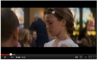
This shows one of the close ups used in the beginning of the film.
Close up: A close up is used in the film to highlight people of importance and to emphasise the emotions of certain characters.
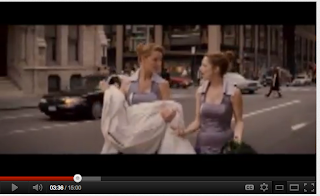
This screenshot shows a medium close up in the film.
Medium Close Up: In this section of the film, this shot is used to underline the surroundings of the characters whilst also emphasising the emotions and actions of the characters in the scene.
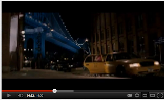
This shows one of the long shots used in the opening of the film
Long Shot: This is used in the film in a number of places to highlight to the audience the locations of the characters whilst also being able to see the clothing and body language of the character that is in the scene.


There a number of other different techniques that are used in the opening section of the film, however, some of them i don't feel are appropriate for the type of film that we want to create and have been used in the opening of this film for the same reasons as the shots i have pointed out above.

This is the link for the film, it has been flipped from the original film for copyright reasons but the film is still visible without being hinderd because of this. http://www.youtube.com/watch?v=1OkLNOCUfLY .


Tuesday, 7 February 2012

Confessions of a shopaholic review

 Talk Talk Review


Running time: 112 minutes
Starring: Isla Fisher, Hugh Dancy, Krysten Ritter, Joan Cusack, John Goodman, Kristin Scott Thomas
Rating 5 out of 10
It is perhaps too convenient to say that a comedy about a chronic shopaholic could have done with shopping around for a funnier script. Is it too much to expect more than an occasional smile or are we supposed to be grateful for even that? If so, then this lifeless adaptation of Sophie Kinsella's bestselling book will just about suffice.


Despite the best efforts of the game Isla Fisher in the role of the ebullient consumer Rebecca Bloomwood, Confessions of a Shopaholic is terminally ponderous and predictable. Populated with clichéd, cartoonish characters with less depth than an American Express card, it's as subtle as a Donatella Versace outfit. What it lacks in humour it endeavours to make up for in color. Echoing Bloomwood's vibrant wardrobe, every scene is constructed from a pop art palette, presumably in the hope that the blinding colors will distract us from the drab dialogue.


The film opens with Bloomwood extolling the virtues of shopping. "A man won't treat you as well as a shop," she declares, which goes some way to explaining why she has huge credit card debts and no boyfriend. A struggling journalist (is there any other kind?), she is sharing an apartment with her best friend Suze (Krysten Ritter) who frequently has to subsidise her fiscally irresponsible flatmate.


Rebecca's ambition is to secure a job with the prestigious fashion magazine Alette run by the formidable Alette Naylor (Kristin Scott Thomas). Responding to an advertised opening, she arrives for an interview only to learn the position has been filled internally. The receptionist suggests the best way in is to work for another in-house publication, which is how the financially naive Rebecca ends up in the unlikely position of a columnist on a savings magazine, with its dashingly handsome editor Luke Brandon (Hugh Dancy). As is the license of fictional fare, Rebecca's column becomes a huge success, propelling her to instant stardom. But while she's being perceived publicly as a shrewd businesswoman, privately she is deep in debt as she struggles to curb her shopping addiction.


As engaging as Fisher is, her character is considerably less endearing. There's something inherently annoying about Bloom-wood who is as self-centered as she is stupid. The A-list supporting cast featuring Joan Cusack and John Goodman as Rebecca's goofy parents and Scott Thomas make the best of their flimsy roles, but even their sterling efforts fail to mask the film's shortcomings.


Considering the present recession, it should be fun to enjoy a vicarious spending spree, but sadly Confessions of a Shopaholic provides all too little respite from the global gloom.


Kevin Murphy 
Financially carefree New Yorker Rebecca Bloom (Fisher) doesn’t just shop. She doesn’t just shop until she drops. She shops until her constantly declined credit cards self-destruct.
Straining under $16,000 of debt and the attentions of a debt collection agency, it’s kinda ironic that she lands a job on a financial magazine where her article about fiscal responsibility is a hit.
Fortunately, she’s also a smash with dishy editor Luke “I won’t let clothes define me” Brandon (Colin Firth-in-waiting Hugh Dancy), who happily looks beyond a bizarre job interview where telling the truth didn’t seem to be an issue.
Fisher's naturally impressive ability to cheekily tweak a scene, comically twist the dialogue or just make her character sympathetic makes you see what partner Sacha Baron Cohen sees in her.
Dancy does what’s asked of him, while John Goodman (as Rebecca’s dad) and Kristin Scott Thomas (as a Vogue editor Anna “Nuclear” Wintour clone) are on hand for old-school class.
Tim Evans 

Above are two examples of film reviews for the film Confessions Of A Shopaholic.  The reviews are taken from websites  Sky.Com and Talk talk which are both independent sources and so will not be bias or unreliable.  Sky's review is probably not the best example to use as it doesn't really describe what the critic thinks of the film nor does it give a rating to give any indication of what the film is like. Talk talks Review is allot better as it gives a clear description of what the critic thinks; in this case the critic has given the film 5 out of 10 stars which would suggest he is  not entirely happy with the film and thinks it could be improved. 

Title Sequence Research

http://vimeo.com/10814574

This is a link to the title sequence of the film P.S I Love You.

I think that this film sequence is good as it doesn't give much away about the film. The title sequence shows the colours of a love story but doesn't give any information away about the storyline itself. This type of title sequence could be good for the film that we would like to make as it includes the mysterious factor of the film in the opening sequence by not giving anything away.

I think the colours used appeal to the target audience of the film and the cartoon characters add a sense of comedy to the opening sequence.

Title Sequence Research


This is the title sequence of the film The Devil Wears Prada. We have chosen to look at the title sequence of this film as it is a similar genre to the film that we wish to create.

I think this title sequence is good and uses colours that appeals to its target market, however, it looks a bit childish and could be aiming at the wrong target audience.

I don't think that this type of opening sequence will be good for our film as it is too simple and lacks creativity. It also lacks the mystery factor that we need in the title sequence of our film.

I have added a website that shows the storyboards for the title sequence of The Devil Wears Prada:


THE DEVIL WEARS PRADA

Storyboards for opening scene and title sequence
Directed by...