- in what ways does your media product
use, develop or change forms and conventions of real media products.
 |
| Lighting in modern scene is allot lighter |
 |
| Candle scene |
Between the two locations we have
chosen to make some of the props the same to give little clues as to what’s
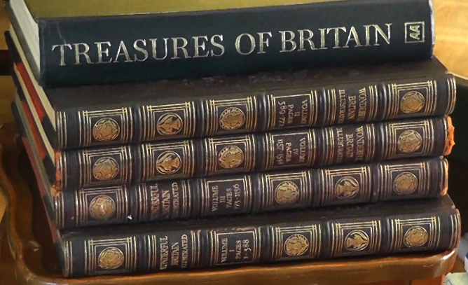
going on and create continuity. Take for example the books, the books which are
seen to be placed on the table in the modern-day are exactly the same books
used in the historical shot.
 |
| This is the books in the modern scene |
 |
| Books in historical scene |
This leads me onto the second
technique we used for distinguishing between the two time zones the use of
editing and camera angles. To ensure that the audience noticed the books where
the same in the two locations we made a point of including a panning shot of
the books in both scenes. This may not be obvious initially however if we where to create the full film we would
have ensured that more shots similar to this would have been used to establish
the connexion. One particular camera shot that I like from the opening two
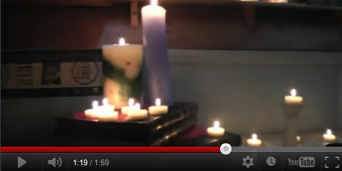
minuets of the film and works well is the one that has the candles in the
foreground very blurred. This shot helps
to add to the mystery of the film and is very unique to our media product.
|
| Blurred candles shot |
I find that this shot draws in
your attention to try and figure out
what your actually visualizing on screen. We chose to keep the editing in the
two locations very similar and at a slow place as it seemed to fit the genre of
our film very well, for example it wouldn’t have looked right if we had chosen
to cut very quickly between many different shots in a historical scene
especially since we wanted to keep the editing at a pace in time with the
music. The music from our clip I think works very well as it fits the tone and
mood and is exactly what we had in mind. To find the right track we had to
search through lots of disks before eventually deciding on pastoral from the
audio network track 1.
 |
| Our font |
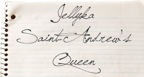
When choosing a text for our credits
we decided that it would look good if we made them look like they had been
handwritten in an old English script like the letter. To achieve this look we
searched for free online fonts and decided to go with one called st Andrews
queen.
One think that is different about our film opening is that we use a voice over. This type of audio is commonly used throughout films to give a brief history of a particular character or to highlight an interest in a particular item. In the case of our film the voice over was used to highlight key phrases of the letter so that we could hint at more clues in our story line. We chose to use a voice over in our film after we noticed that it had be done in lots of other films for example confessions of a shopaholic and bride wars. Witch we had already analysed in research for our film.
2.How does your Product represent particular social groups?
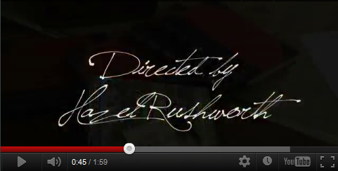 |
| This shows how our font looked in the film |
One think that is different about our film opening is that we use a voice over. This type of audio is commonly used throughout films to give a brief history of a particular character or to highlight an interest in a particular item. In the case of our film the voice over was used to highlight key phrases of the letter so that we could hint at more clues in our story line. We chose to use a voice over in our film after we noticed that it had be done in lots of other films for example confessions of a shopaholic and bride wars. Witch we had already analysed in research for our film.
 |
| This film also uses a voice over |
2.How does your Product represent particular social groups?
The main social groups I think
that our film represents is the young male and female genders this is because
it looks into the complications of the relationships they have with one another
and how they go about tackling these issues. Like the majority of films in our
genre we have chosen to stick with the normal stereotypes of the characters in
the film. However one thing our film does do differently is compare how the perception
of this social group is different in the passed to what it is today. In the
opening two minuets of our film we tried not to really create a dominate
character as such because of the inkeeping with our mistery genre we achived
this by the the lack of dialogue and
interaction with one another. One of the shots we have used in our film could
possibly contradict this. This is the shot in witch we have a young female sat
on the floor whiles another character walks passed and places book on the
table. This to me creates a power argument between the two characters for
several reasons. Firstly it is obvious that in the relationship of the two
characters the character that walks down the stairs is the more dominant of the
two represented by the fact that the camera pans up towards this character and
tracks her movements across the room. This character is also higher up in the
shot and above the head of the young female. The second thing that shows this
character is more dominant is when we show a close up or our young girls face
the character is clearly upset and has to look up to see the passing person walk
passed however, the power balance is disrupted by the fact that it is the young
female is on the screen a lot more than the other character whose face we don’t
even see. This means that for the purpose of our storyline it is in fact the
young female who will be more important and the other character isn’t really
much at all.
 |
| Showing how the young girl looks up |
|
| Sowing how one character is set higher than the other however no face is seen |
In our film we wanted the audience to be able
to associate the fact that the young girl and the person writing the letter
where in a similar situation to each other we did this by dressing the
characters both in very dark clothing that could quite easily represent there
mood. We wanted the audience to feel the stereotype that this age group feels
in that they are easily isolated and feel separated from the others around them.
One final thing that reflects this is the tone of the music we have used in our
opening sequence it is very low in tone and slow paced creating a sad and mysterious
atmosphere.
3. what kind of media institute might distribute your media product and why?
3. what kind of media institute might distribute your media product and why?
If our film was distributed it
think that a fairly large and substantial company would do this for example Entertainment
distributors. The reasons for doing this are that it is quite hard for small
independent film to get noticed when competing against big Hollywood
blockbusters Especially since there is becoming more and more ways to watch
films not just at the cinema. What we particularly liked about entertainment
was that they already had a substantial collection of films they had already
distributed that include both big budget Oscar winning films along with other
smaller productions.
 |
| One of the companies who we thought could distribute our film |
We did look at other distributors
for our film including the British film council however we felt that
Entertainment would probably be the better of the two. A main factor in this
decision was the feedback from our questionnaire results in which it emerged
that more and more people are watching films in other ways such as on demand,
online or illegal downloads. This therefore meant we would have more chance of
getting a larger audience to watch our film if we went with a company that did
more than just cinema releases. Another thing that our questioners told us is
that it would mainly be women who would watch our film. This means that for
distribution purposes we would know how to target this type or audience.
Example of this would include putting posters in women’s magazines or showing
the trailer for our film along with other films of a similar genre. Below are some images of magazines we could
potentially advertise in.
4. Who would be the audience for your media product.
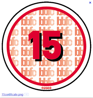
In order to establish who the audience for our media product would be we carried out some extensive research into the different types of film audience. The first part of this was to go online and read reviews on films with a similar genre. From this research we where able to establish a link between our type of film and women aged 15 and above as these where the type of people who gave the most positive feedback. To back this research up we then sent out a question-air asking people about several aspects of our film who they where and what other films they liked to watch. The question airs we sent out reflected our initial research and came back with the same results the same results. After deciding on a final plot line for our film we then went onto the BBFC website to establish an appropriate certificate for our film. after great discussion we establish that it would probably be more appropriate for a 15 certificate as some parts of our film would not be appropriate for younger audiences and due to the complexity of the story line they may not have understood it properly anyway
 |
| Examle 1 |
 |
| Example 2 |
4. Who would be the audience for your media product.
In order to establish who the audience for our media product would be we carried out some extensive research into the different types of film audience. The first part of this was to go online and read reviews on films with a similar genre. From this research we where able to establish a link between our type of film and women aged 15 and above as these where the type of people who gave the most positive feedback. To back this research up we then sent out a question-air asking people about several aspects of our film who they where and what other films they liked to watch. The question airs we sent out reflected our initial research and came back with the same results the same results. After deciding on a final plot line for our film we then went onto the BBFC website to establish an appropriate certificate for our film. after great discussion we establish that it would probably be more appropriate for a 15 certificate as some parts of our film would not be appropriate for younger audiences and due to the complexity of the story line they may not have understood it properly anyway

5. How did you attract/address your audience
To attract our target audience we thought it would be best to find out exactly what they liked. Our way of doing this was to send out some question airs and then make our film reflect there answers. It was important to us that our film was unique to other films in the hope that it would attract as many people as possible. To do this as a group we pulled together a list of ideas of ideas that would make our film stand out that included several shots and editing techniques. The first part of doing this was the application of credits to our film we wanted them to tie in with the mood of the film and reflect the genre as much as possible. Our way of doing this was to make the script look like the handwriting on the letter so that it introduced the audience to feel part of the story as this text was written specifically for them. In our filming we used a variety of shots that would hopefully make the audience feel that they where part of our characters world. Some of the shots that do this is the montage of shots in witch the character is writing the letter. This is obviously a very private seen but yet the audience is allowed in and is able to see and hear the deep inner thoughts of the character. The genre of our film was mystery this meant that the people who came to watch our film would want to try and solve what was going on whilst they watched. In our opening to minuets we there for felt that it was essential to put in some subtle clues that the audience could piece together . For example there is the obvious clue of the letters, but there are also some more discrete ones like the title of the books on one of the table " Treasures of Britain".
 |
| Handwritten style text |
6. What have you learnt about technology from the process of constructing the product.
For our filming we used a Panasonic HDC-HS80 which allowed us to film in HD giving a much better picture quality. This model of camera features settings for a wide range of shooting situations from close up to far away subjects making it highly appropriate for what we required it to do. This camera features a 33.7mm wide angle lense, to realize shooting at a close distance from a subject both the subject and its surrounding environment this was essential for some of the pulling focus shots we used in our filming.
 |
| The camera we used |