Title sequence analysis
In this piece of writing is my individual analysis of a
title sequence of a film and the opinions I have on it. Included are the things
that I think work particularly well for this opening sequence along with my opinions
on what doesn’t work quite as well and finally any ideas or inspiration I gaged
from the sequence that we could possibly use in our film. For my title Sequence I chose to look at the
film confessions of a shopaholic. There are many reasons why I chose this film
for my analysis, firstly it is a film that I have already seen before and know
the story line. Secondly the genre of the film I similar to what our group
would like to recreate and finally, as a group we have already looked at this
film for other parts of our project and therefor it ties in well with what we
are doing.
The main aim of the title sequence in this film is to give
the audience a quick background history of the lead character so that they can understand
what has previously taken place to lead up to the events that take place in the
film and the situation that the character has found them-self in. In this opening sequence the director has
manage to establish to the audience both the main plot without giving much away along with familiarising the
audience with the main character and her story. One key aspect of this particular
opening sequence is that it shows both the past of the character when she was a
child along with what is meant to be the present tense. I think this is a good
opening method for a film as it allows the person viewing to catch up on
everything that has happened in a characters life so far in a very short amount
of space without them even realising this it has happened. This therefor allows
the rest of the film to be able to quickly glance over topics without spending
too long on them which could making the film boring and leave the viewer confused.
Like most opening titles this film opens up with the distributors
of the film along with other key people involved in the production before moving
on to the action its self. From her it then progresses with a fade in from
black to a pair of shoes. The fade in this opening sequence is essential as it helps
to highlight the importance of the particular object and focus the viewer’s
attention to the centre of the screen.
After the fade a panning shot is then used
to display more components of the shot witch turn out to be more pairs of
shoes. The colours and composition of this shot are critical to its message
that it is trying to get across to the audience. This is because the film is
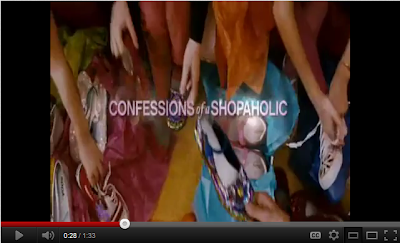
trying to show a juxtaposition of two separate lifestyles. For example in first 17 seconds or so after
the fade is used the screen is filled with lots of bright coloured tissue paper
and expensive pairs of children’s shoes. The screen is filled with very fussy objects leaving nothing individually singled out. Compare this to when the brown pair of
shoes are shown. Instantly the audience can see a clear difference in the two
shots as one is very vivid and happy where as the other is very boring and
plain reflecting the mood of the character. The shoes are shown alone in the center of the shot hi lighting there importance. Just to the right of the image a red shoe can be seen from the previous panning shot this is a clever thing for the director to do as it leaves just a slight reminder of what you are comparing the plain brown shoes to
 |
| Compare bright and fussy |
 |
| Singled out individually |
There are mainly three types of editing in the opening
sequence of this film. Firstly props are used as a kind of wipe to show the
transition of years along with revealing some of the opening credits.Secondly slow paced editing is used to lengthen actions over what would happen in real time and finally cuts are used in the transitions of shots. I think that using props as
wipes is a good technique as it creates visual interest for the audience. One
problem I have however is because not all of the credits are reveled in this
way it creates a lack of consistency that is quite noticeable.
The second way titles are reviled in this film is by using
cross fades I on top of the onscreen action. I like how this is done as it
prevents the audience’s attention from being drawn away from the main action on
screen to just the text. This is especially useful as it prevents the viewer
from missing out on any important detail. Another way the editors have kept the
text at a minimum distraction is by keeping it small in a simple font that is
not too over the top along with using a light colour that blends into the
action preventing it from being too in your face.
 |
| Example of the barely noticeable credits |
Throughout the opening sequence lots of visual aids that are
associated with shopping are used. This is a good way of presenting the plot of
the story to the audience as gets straight to the point without any audio
description required. In the clip there are two types of audio used the first is a backing track and the other is a voice over of the lead character. The backing track used in this film is very upbeat and reflects the overall tone of the film making it very suitable for in the opening sequence. Straight away it helps set a calming relaxing mood for the viewing audience that they should hopefully feel comfortable with. In this opening sequence a voice over is used so that the character can tell you a little bit about there past and introduce them to the audience. I think this is a very good technique to use and is potentially something we could incorporate into our film.
In conclusion i think this is a very good opening sequence and the only thing i would potentially do different would be to improve the consistency of the title revealed. I think that the technique we are most likely to take from this opening sequence is the voice over as it is something that would be very useful for our film.


No comments:
Post a Comment